The Client
Sarah Clark came to us as another former member of the same agency group as Sacha Scott. Having decided that she was more than capable of venturing into the industry on her own, she decided to “take the plunge” and set up her own estate agency.
Sarah Clark herself has some great experience in both sales and marketing but has always had a passion for property. Deciding to take her passion and her experience and build her own business, she’s gone on to found Sarah Clark Property Consultants.
The Project
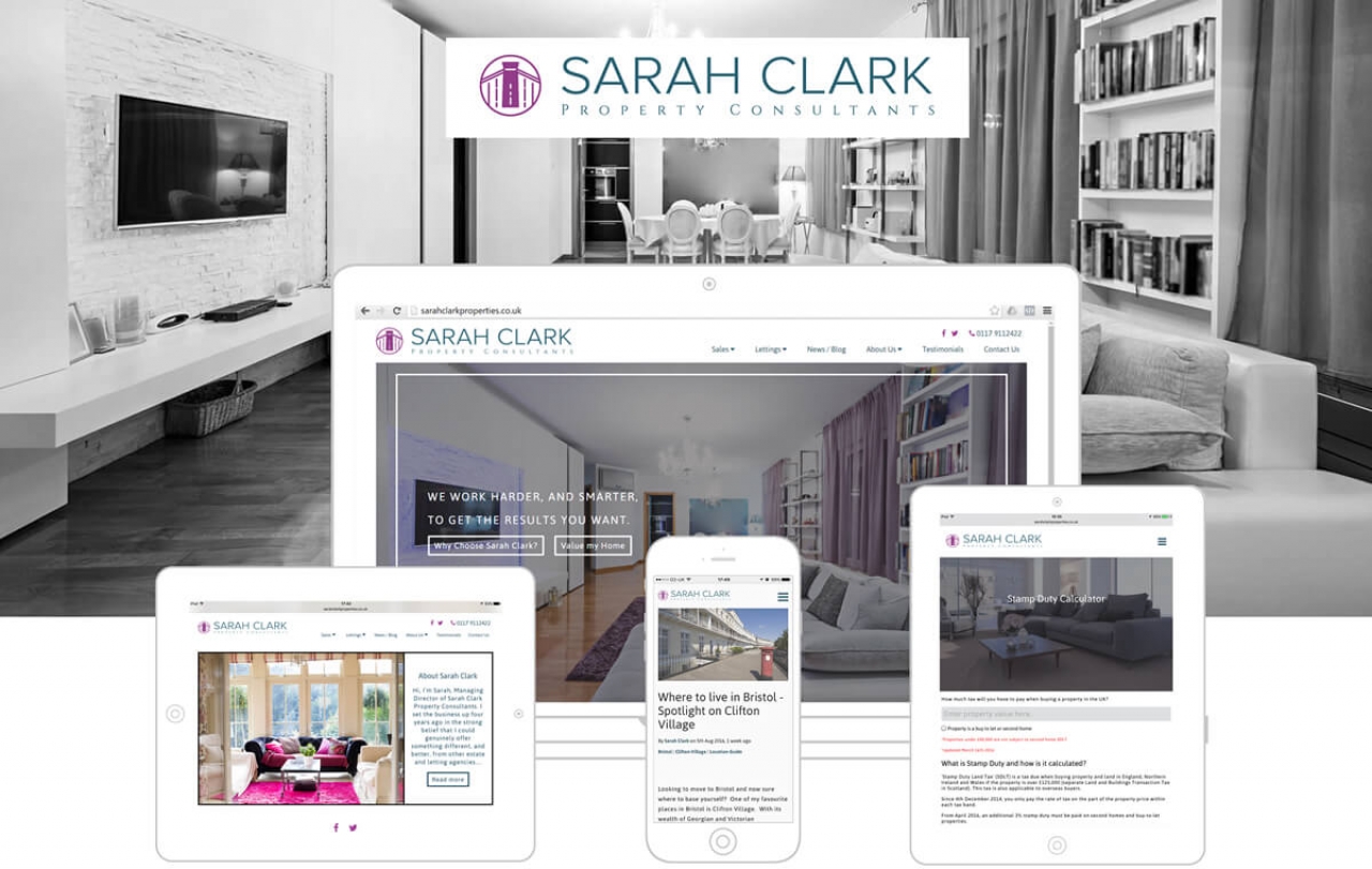
As Sarah Clark came to us at the start of her journey, we were able to offer more than just a website build. We worked with Sarah on the new company branding, helping her convey her message to a new client base.
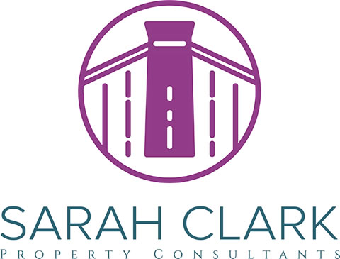
Sarah wanted to stand out as an expert in the Bristol and Clifton area so we decided to start there. The Clifton suspension bridge is an iconic landmark and instantly recognisable to locals, making it the perfect symbol to represent a local estate agent. Using one of the towers as a basis for the logo, we incorporated modern flat design with an elegant font to give the feeling of both local knowledge and quality service. We then took this design and created full brand guidelines, including printed materials and stationery templates. You can see the logo below:
For the design of the site, we continued with the theme of modern flat and clean design. The homepage is segmented into various different boxes to make navigation easy for a user while still being easy on the eye. Mixing this with some warm, welcoming photography we’ve created a compelling website that is instantly recognisable, incredibly easy-to-use and fully represents the brand.
To have a closer look at Sarah Clark's chosen branding and Website, click here.